
Maps as Data

I’m teaching my undergraduate economic history class this semester. EC 365 is full (the 54 chairs in our classroom set a hard cap), but seat limits don’t bind here at Broadstreet! The official course description was not written by me and says I’m going to teach about “water management and fisheries” (seriously). I don’t. Instead, the course examines a selection of the major themes in the economic development of the United States. In reality, that means we read a lot of recent research papers that I think are good and important, but also that are digestible by undergraduates armed with not a lot of econometrics.
Unlike a PhD course, I know I’m likely not training the next generation of economists to go out and do independent research. Besides, writing a complete original research paper during a semester-long course is very hard and in economic history, with a premium on collecting new old data, it is nearly impossible. But that doesn’t mean my students can’t come up with their own research questions and in the process learn more about where questions come from and what makes for a good or interesting or novel or exciting question.
To that end, I assign research question assignments. I think of these as the very first step you would take before starting original research. As I try to convince my students, getting familiar with this step will deepen their understanding of the social science research process.

My first assignment is all about maps. A lot of great economic history data comes from old maps. Some of my own papers start with maps, like the Boll Weevil (above) or Sherman’s March. This assignment actually lines up nicely with a post that Alexandra Cirone wrote last spring here at Broadstreet (and I’m regretting not remembering that before assigning it and having my students read the post and her list of links to historical map databases!). Essentially, I tell my students to go and find a cool map and ask a question with it. (I also ask them to be good historians who care about context and sources and so they need to try to figure out who made the map and when and why.)
The map could be a Y or an X. I don’t want them to get too hung up on identification, though I complain about that enough in the rest of what I teach that inevitably students try to think up clever instruments or fool-proof difference-in-difference designs. But I do want them to think hard about causality and make a logical claim about why the X that their map shows could cause some Y or why some X could cause the distribution of Y they see in the map.
When I was grading the assignments, I was really enjoying reading them (not kidding) and I thought that the Broadstreet readership would as well. So here are four of the interesting maps that my students surfaced this week (with their permission). Where they’ve anticipated or echoed recent research, I’ve included links, but if there are other papers that are related let me know. My students love hearing that they’ve independently stumbled on an idea that a “pro” researcher had.
US Bombing in Cambodia
The first map was made by Taylor Owen and depicts US bombing missions flown over Cambodia during the Vietnam War based on US Air Force raw data, covering 1965-1973. For more, see this paper. Not all maps have to be historical, just of historical events (it helps that the data underlying the map was collected contemporaneously). My student suggested measuring the long-run effects of the bombing on anti-American sentiment among civilians after the war. Of course, selection is tough here (why certain areas were bombed more or less intensively?) and precise geographic data on outcomes might not exist, but this echoes a pair of recent (and excellent) papers. Melissa Dell and Pablo Querubin studied the effects of bombing in Vietnam and Juan Felipe Riaño and Felipe Valencia Caicedo looked at the legacy of the secret war in Laos. Not bad company to be in for a research idea.

Sidenote: I challenge anyone to come up with a better historical RD than what Melissa and Pablo use. From the abstract “[This study] identifies the effects of bombing by exploiting rounding thresholds in an algorithm used to target air strikes.” Melissa got a standing ovation at NBER DAE over the data collection and RD in this paper.
Long-Run Effects of Feudal Institutions in Italy

As my student writes, before Italian unification (the “Risorgimento”, or the “re-organizing”), “the now-country was a series of feudal nation-states with different styles of government, such as republics, church-states, dukedoms, and kingdoms. These different forms of government had different laws and norms surrounding how citizens could and should live their lives.” She proposes to study the long-run effects of these different feudal institutions on outcomes today. Of course, a great deal of work in political economy and economic history follows in this vein, trying to understand the effects of institutions and culture in Italy (either looking at north/south differences or variation with regions or across institutions). One can see reflections of Italy’s pre-unification past in economics, politics, and society.
(A review of recent Italian HPE research as a nice post here on Broadstreet, so if anyone wants to volunteer, let us know.)
Foreign-Born Share in the US

Another student proposed a Henry Gannett map based on 1900 census data. It shows the share of the foreign-born population in each county (the map above is actually from 1890 but I guess my student is better are searching the Library of Congress than I am). What are the effects, my student asked, of immigration on American attitudes towards immigration today? She hypothesizes a positive effect both via exposure (something like the contact hypothesis) and through family history. The endogeneity of where immigrants settle in the US complicates things (in 1900, we can see how few immigrants are in the South and how many immigrants are living in the urban north and midwest). But, we think that is very much the case and with evidence for both mechanisms she specifies.
Paola Giuliano and Marco Tabellini have a recent working paper on the long-run political effects of immigration during the Age of Mass Migration on political ideology today. In the Seeds of Ideology, they argue that exposure to Europeans with imported ideas about safety nets. And with Ben Schneer and Max Palmer, I have a working paper on the effects of immigrant ancestry on attitudes about immigration (at least among members of Congress).
I’ll also note that late 19th and early 20th century census maps are some of the prettiest maps out there, see more Gannett maps here.
Greyhound Bus Lines from 1935
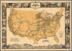
Another visually attractive map, though I suspect this one was designed as an advertisement for Greyhound as much as a record of historical data. Greyhound buses connected the country, even before the national highway system. A pair of students proposed very different questions based on this map which could help us understand anything from the long run effects of tourism on economic growth and development to measuring tourism demand historically.
Not every historical map will lead to a question and not every research question will have a map. And there is nothing worse in a presentation than showing two choropleth maps in quick succession and asking audiences to do ocular econometrics. But if you’re wandering around looking for ideas, browsing maps on the Library of Congress or at David Rumsey’s site are excellent ways to spend some time.